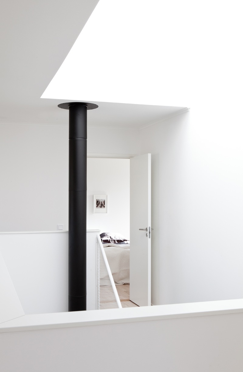
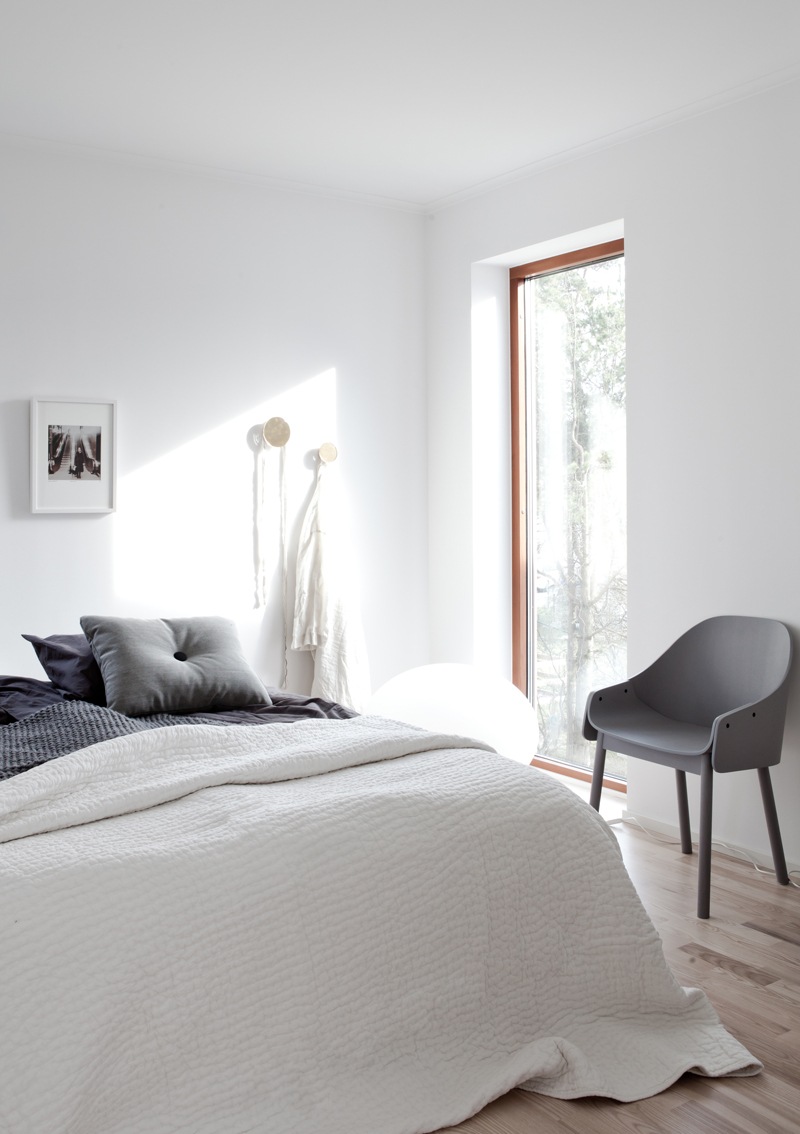
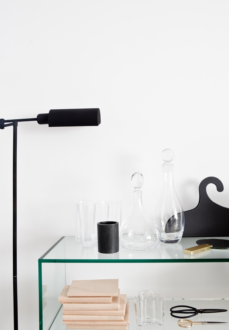
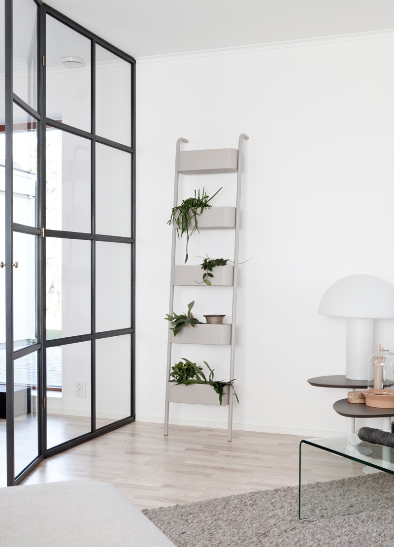
This place really embodies the idea that less is better. Not that it’s extremely minimalist but it has just enough of the right elements to make it interesting without the annoying (at least to me) extras. Some green plants, shiny glass, soft wood, small amounts of metallics and varying shades of white, taupe and grey. It doesn’t get much better.
Styling by Annaleena, found thanks to Husligheter. You can see this home for sale in its entirety here.


