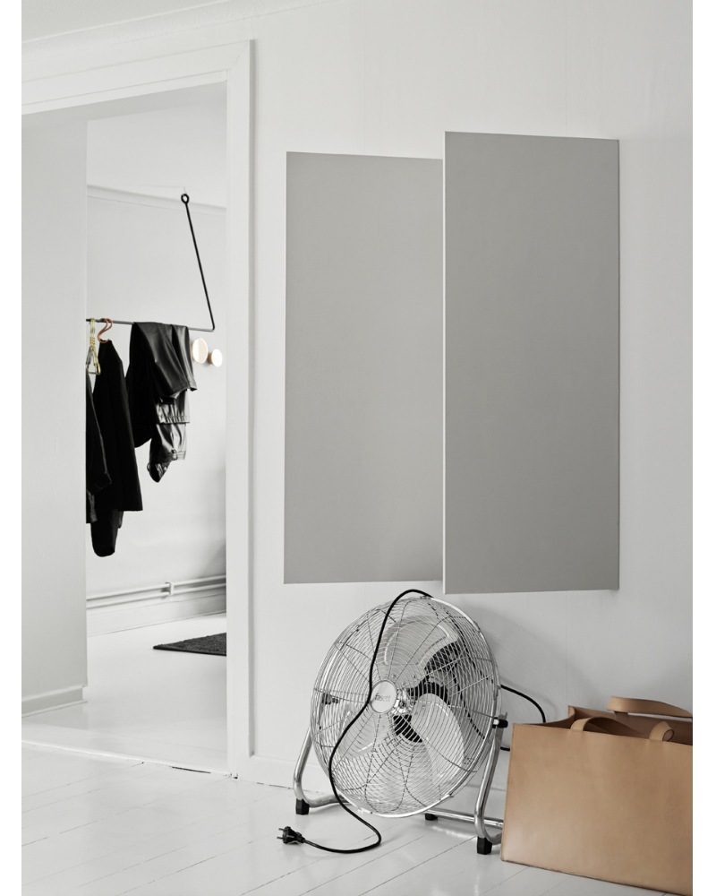
Annaleena Leino‘s new place in Stockholm was recently photographed for Residence Magazine. She designed/made those angular shelves herself.
She’s quite amazing and I’m a super fan of hers.
A sneak peek at Bolia‘s 2014 catalog shoot from Emma’s blog.
Such great shapes + materials.
This is one of those images from a house tour who has already made its way around the blogosphere but I guess for good reason. The dark textured grey combined with the really warm wood offers something for everyone.
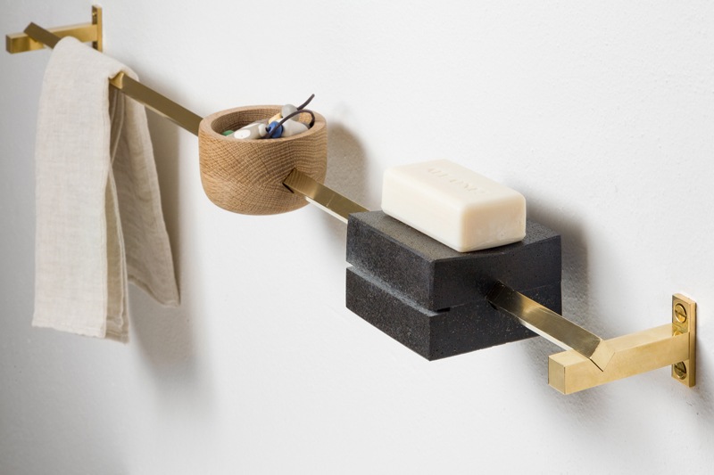
There is a pretty obvious shape theme happening among these images and I love it. This amazing organizer (found from Josefin’s new blog) made by Groupwork is an a piece of decor all by itself. The brass/wood/stone combination is harmonious together and really interesting to look at. Nice work!
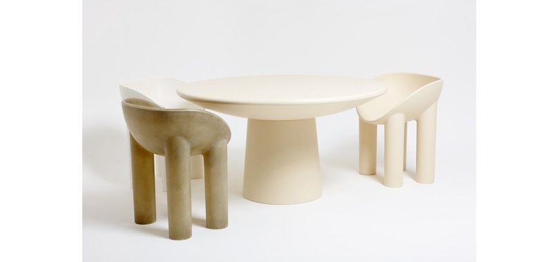
There’s something about these thick, rounded Roly Poly table & chairs by Faye Toogood that are really fun.
They are really quite majestic with their long elephant like legs and perfectly rounded back. Sleek and playful.
These industrial feeling details of a pot & brush rack feel so fresh and natural for a kitchen space.
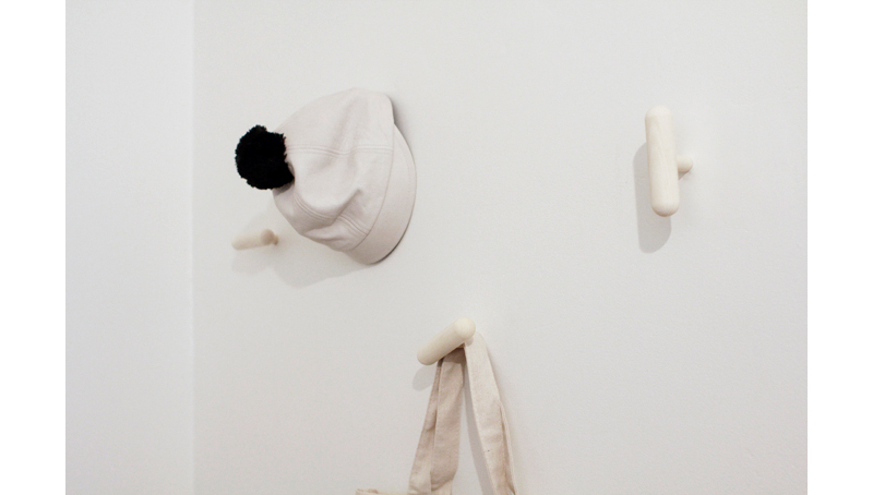
More great shapes that are so practical, Visi designed by Studio Macura and image by Varpunen.


