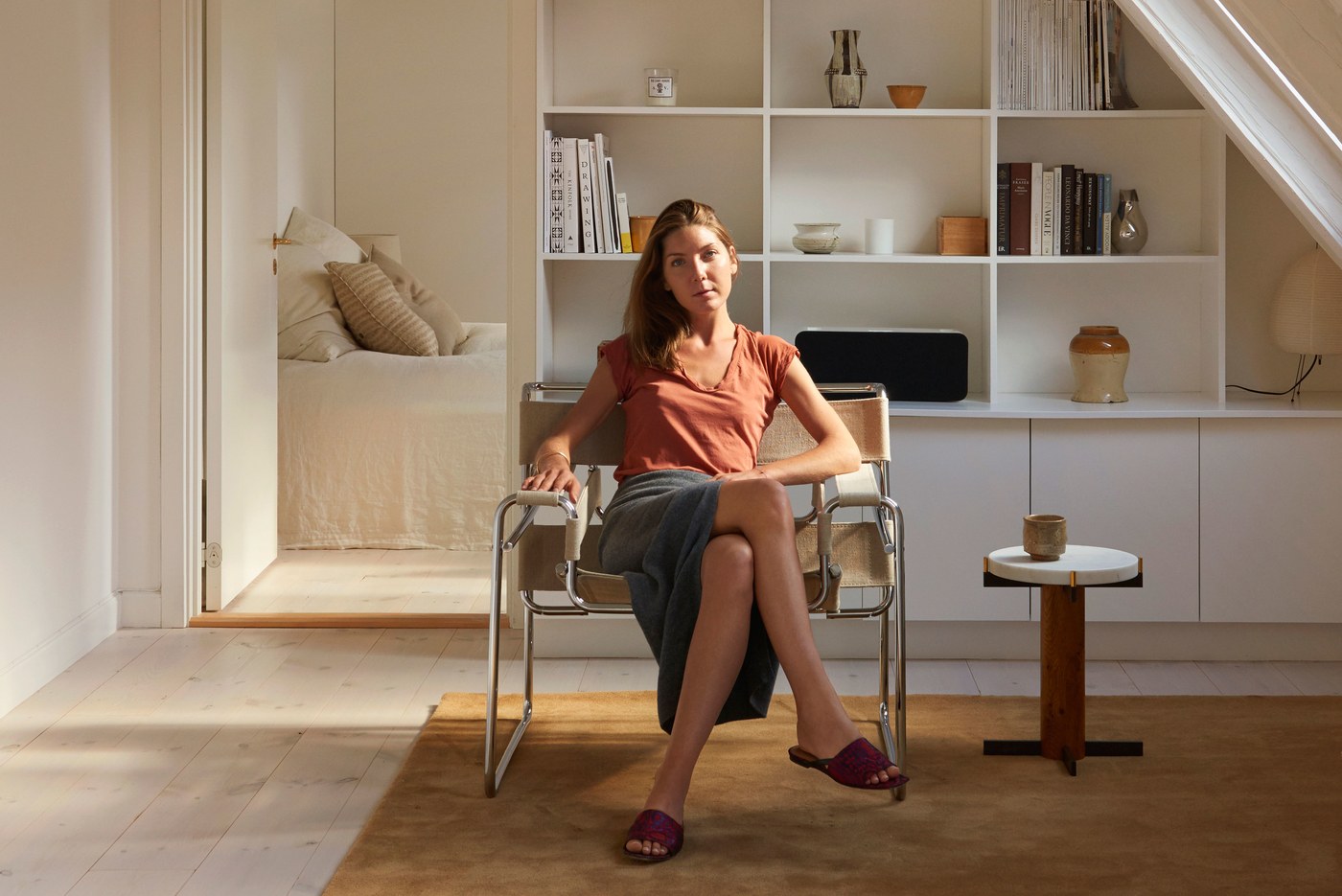
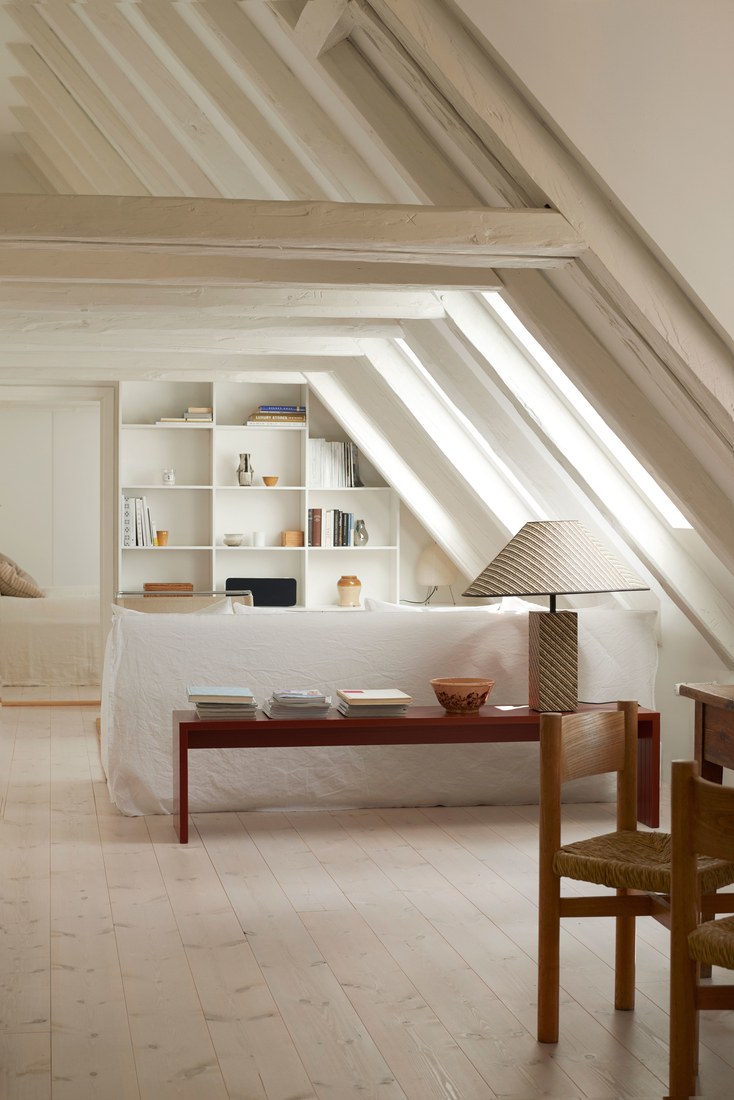
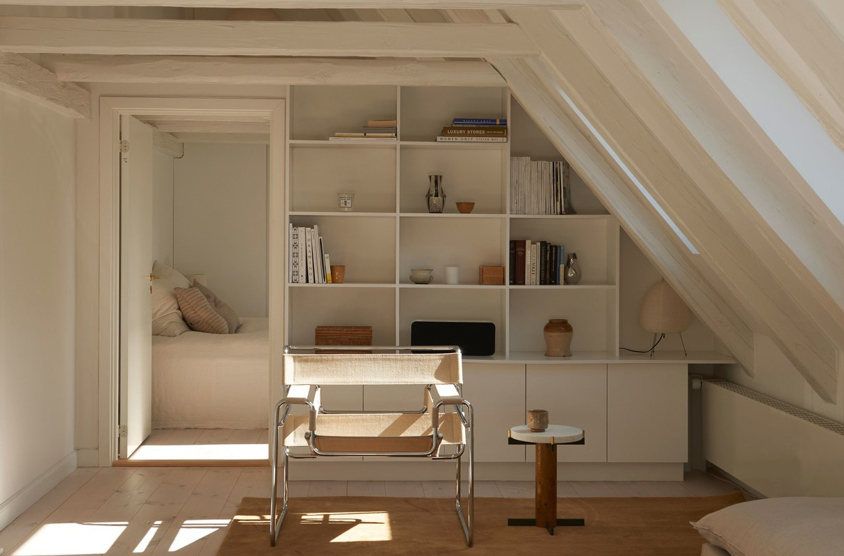
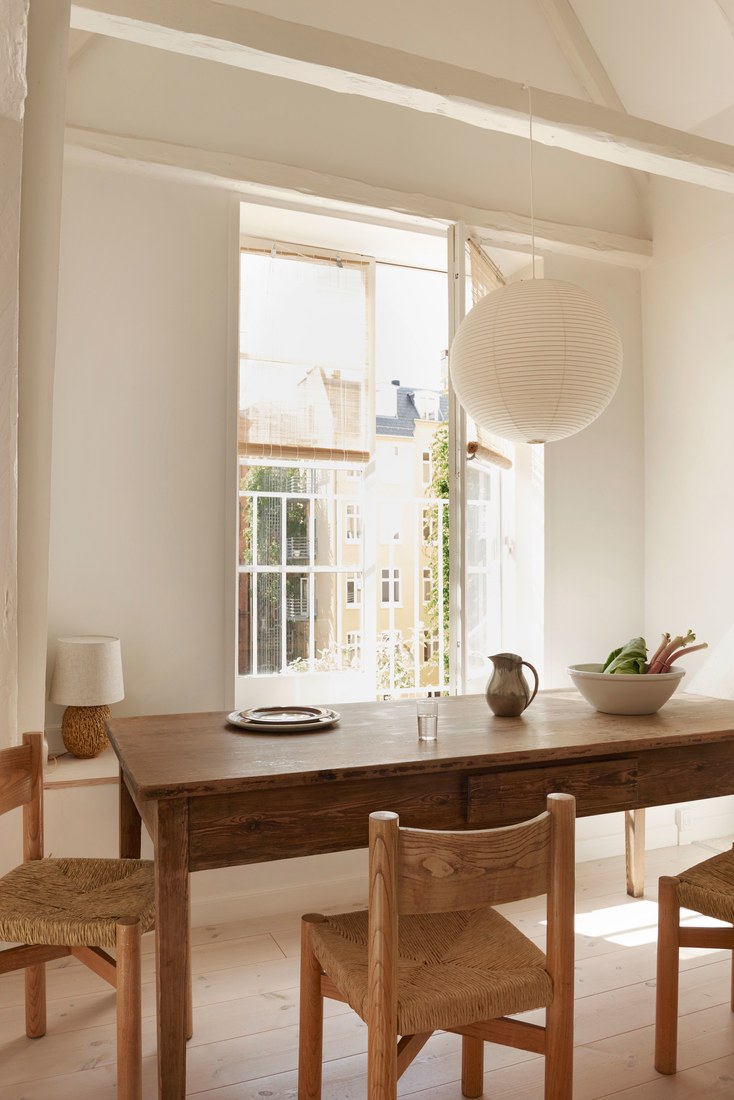
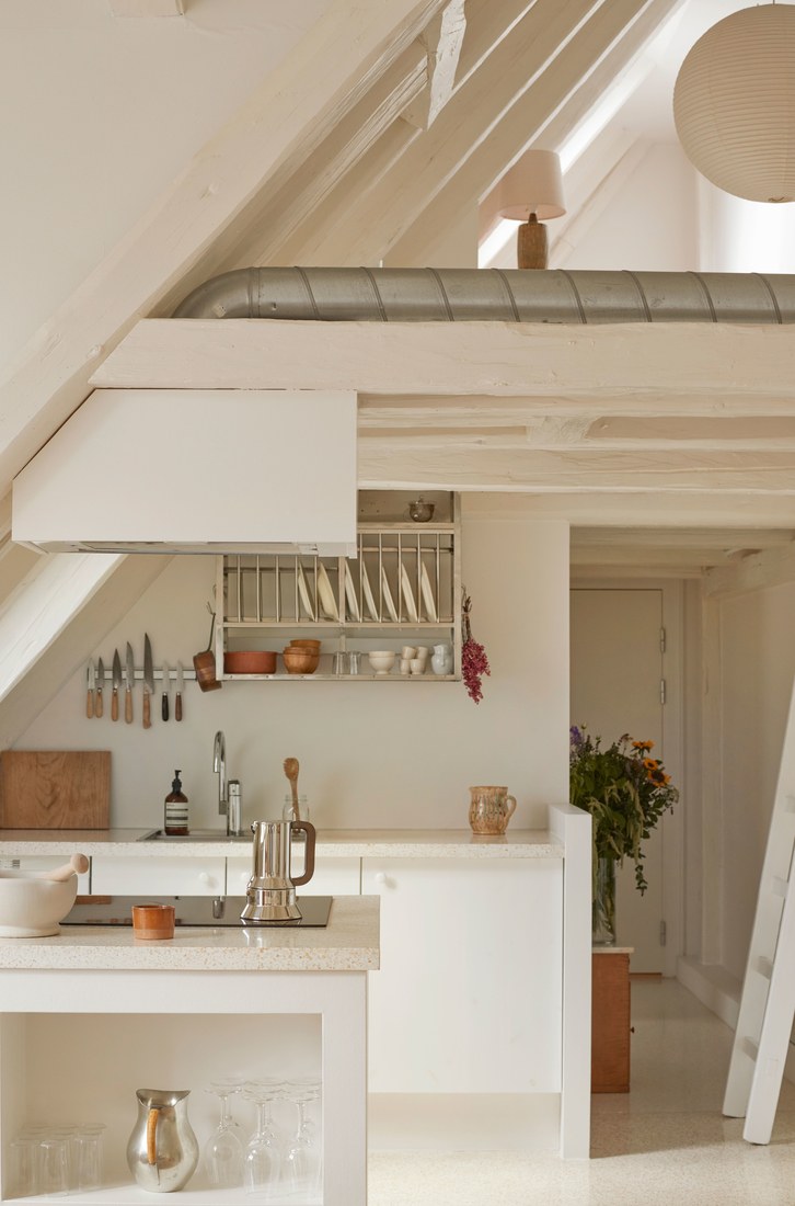
The home of designer Caroline Feiffer is bright, natural and sunlit home, full of geometric pattern that contrast the earthy tones throughout. Caroline lives in Copenhagen and designed her space to be a mix of old and new, style and form and most of all a space with balance.
On the second floor of her 860 sq ft home, Caroline’s husband Steffan who is a woodworked, has built her an atelier. In order to keep her home balanced she divides any potential new pieces into a “need to have” or “nice to have” category, a tip a lot of us can adopt in our own homes as well! The home is also full of collected treasures from travels that are displayed neatly on a half-wall leading to the bedroom by her husband, in front sits a beautiful Wassily chair upholstered in natural woven fabric. In a home such as this, curated with one-of-a-kind collected items it’s wise to protect them with either homeowners or renter’s insurance, just for that extra piece of mind that your valuables have some sort of support.
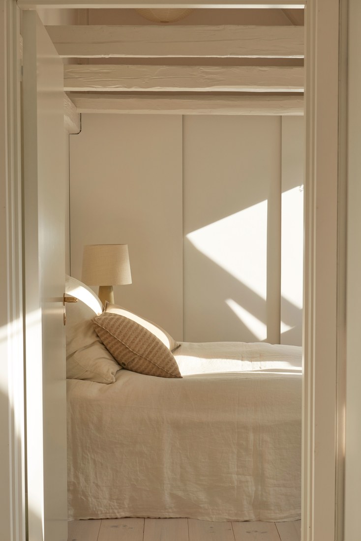
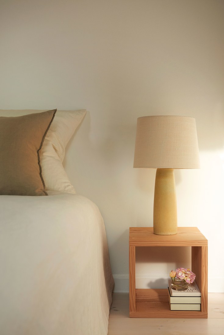
The bedroom’s simple white bedding is anchored by a table lamp by ceramicist Palshus fitted with a new linen shade. The modern cube bedside table is another of her husband’s wood creations. Every object in the room is intentional and uncluttered like reading books and flowers from their garden.
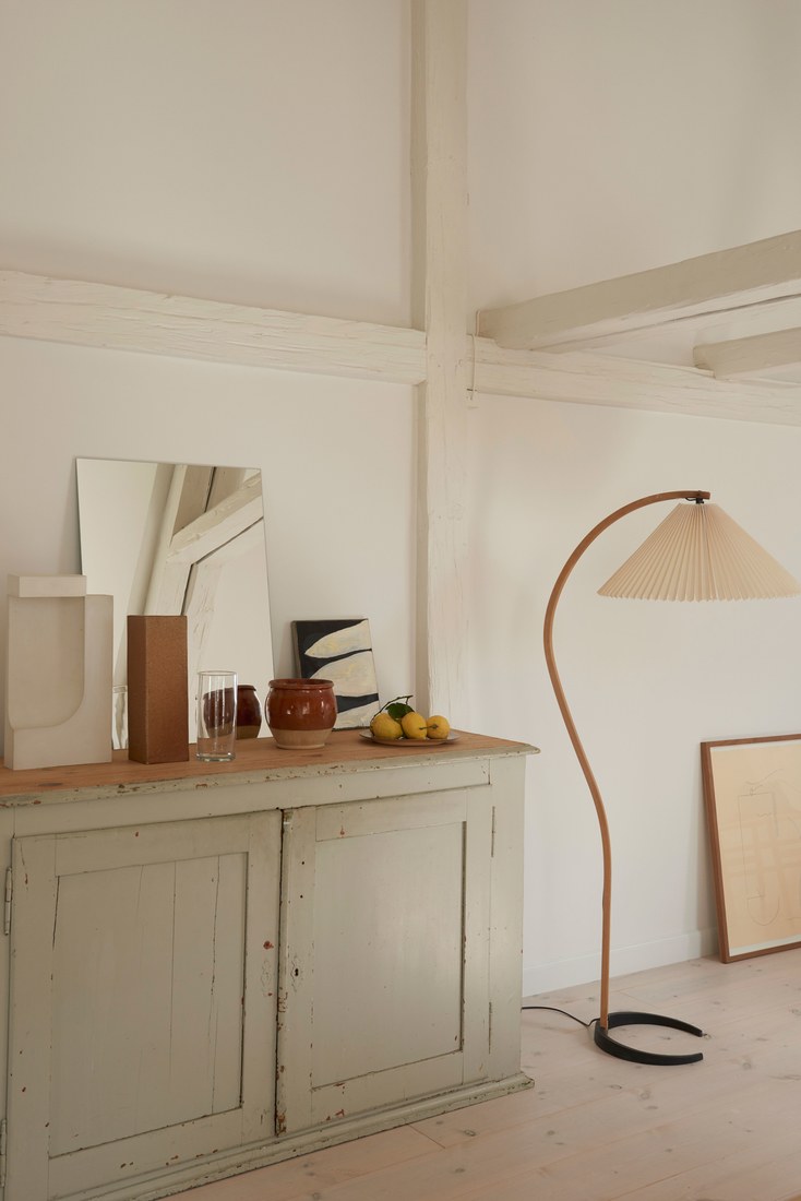
Above is a swan-shaped floor lamp by Mads Caprani with a Le Klint shade and an oil painting Mathias Malling Mortensen ads a bit of graphic art. If you’re not able to get your hands on a unique painted piece like this try creating your own collage with mixed media such as fabric and paper and making a larger copy of it. You can either create this on thick paper to frame or if you’re a photographer, using one of these best photo printers, you can print some of your own work. Both simple ways of creating custom artwork for your home.
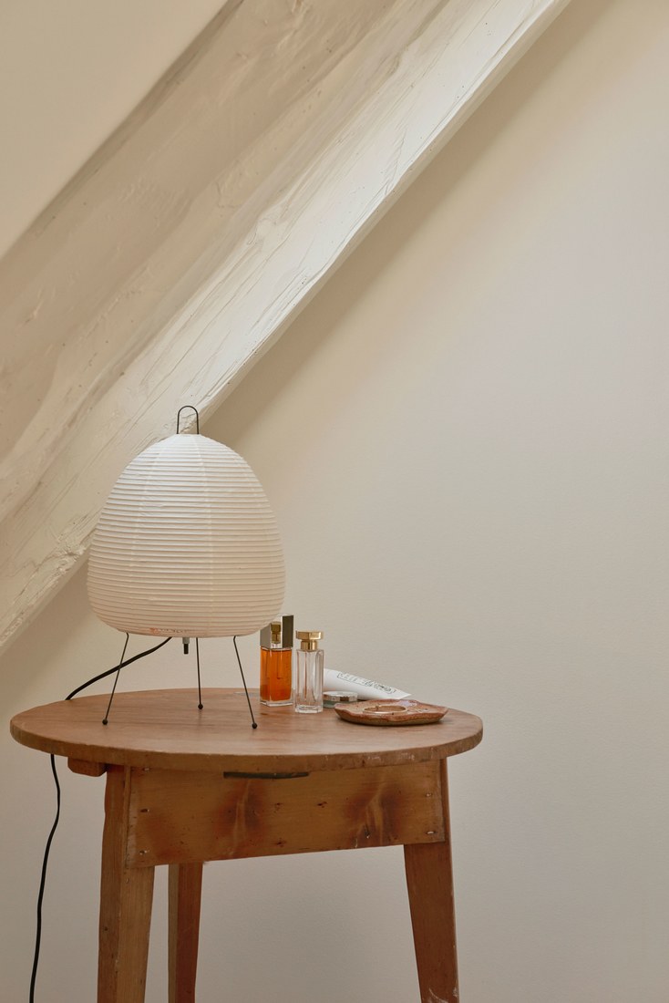
An Akari light fixture provides light atop an antique wood round table in the bedroom, all in front of one of the slanted wood beams that she painted white (they run all along one wall of every room in the apartment, adding character but also making the layout more complex).
Photos by Katrine Rohrberg
