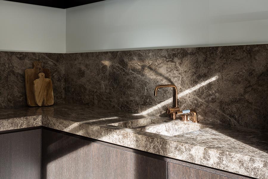
When we renovated our kitchen 3 years ago I wanted the opposite of what we were ripping out, which were these ugly honey colored cabinets and contractor tile. It was a big beige blob, ornate and unattractive. Since it was here with the house when we moved in I did not choose any of it and I certainly didn’t feel that it represented in in any way. My rebellion towards this ugly kitchen was to run in the opposite direction, flat white cabinets, smooth countertops (no tile) and a strip of black upper cabinets. Our next kitchen though will probably return to some form of natural tones, browns and taupes and hazelnut colors but still with minimal lines.
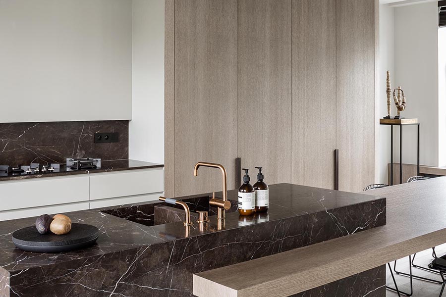
I really wish I could find the source for this image, does anyone know where it’s from? It was saved to my desktop months ago, then forgotten about and this morning I unearthed it from a pile of other images, having long forgotten where I found it.
*update, thanks to a few kind readers I found the kitchen source is from JUMA Architects.
Anyways, the brown marble, natural wood cabinets and copper faucet are major inspiration as I think to the future and our next kitchen.


